Narrowing the UOA List with Sector Sentiment
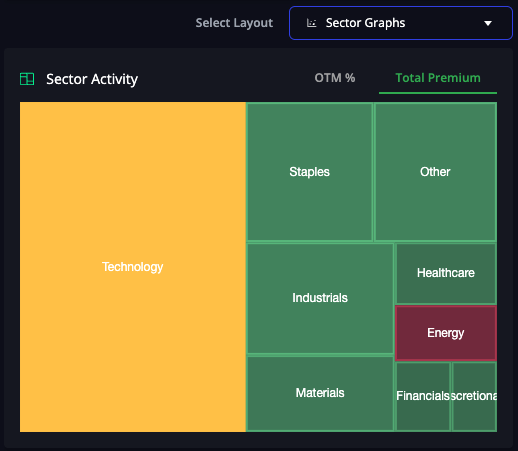
When deciding which tickers to research, you can narrow down the list by looking at the sector sentiment graphs.
Wall Street expects the biggest price movements with the most “consensus” in sectors with the highest OTM % and overwhelmingly bullish or bearish premium flow.
These two graphs help you avoid trading “against the current.”
All ships rise with the tide, so it can be easier to trade a bullish position in a sector with almost all bullish flow.
The graph below shows that the technology sector has mixed sentiment, the energy sector has bearish sentiment, and all other sectors have bullish sentiment.
Based on the sector sentiment, we’d avoid technology and energy tickers to increase our chances of success.


